Visit My Studio

Do you enjoy visiting artists’ studios? Spend time in another world? I do, I love it! 

An artist’s studio gives you insight, walls filled with inspiration, memorabilia, writings, flyers, invitation cards... One notices the workflow, the equipment collected through the years, the stack of papers, the assortment of book cloths...

I love small thingamajigs sitting on shelves or ideas pinned to boards. You can visualise the beginnings of a final piece, you can sense the artist’s mind cogitating.

Going from one project to another, how do you dust off your worktable and unburden your mind for a new project?

My mind gets clogged around what I call crunch time—the stretch between finishing touches, call for entries, the prospectus for new books! I can’t brainstorm for this post. No bright ideas to write, aucune idée, nada, zero...

Let's take a break and take this opportunity to visit my messy studio. My half studio not big gets messy fast. I had to move out a filling cabinet that supported my old Epson 2200 to make room for this—

 My Epson 2200 sits on a plastic bin to print business cards today.

My Dahle 554 cutter has found another calling—a bench for Finding Home's different elements of to be assembled.

cutter.jpg

My tools are full of glue so cleaning is a priority. How do you keep your tools clean as you work? Any advice is good!

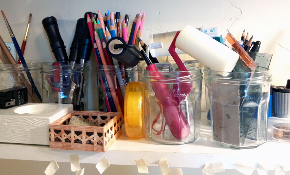
At least, my small tools are in place.

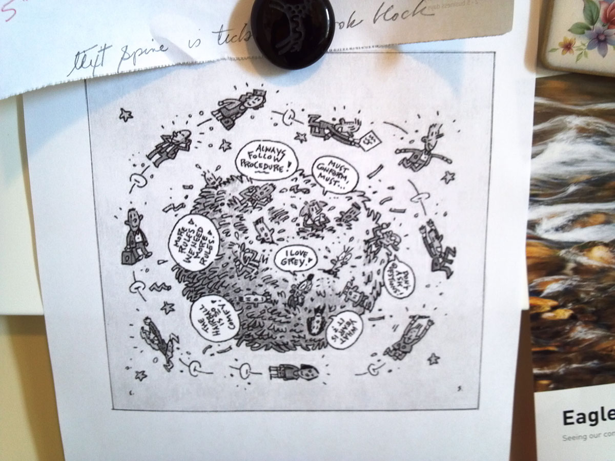
My walls are full of artwork that inspires me but since the world is spinning fast, this cartoon reminds me to take it easy.

And the results of my labour, books and more books! How big is your inventory? 

Do you have a plan to organise your archives? Do you plan for the future for what happens to your legacy?

Work awaits...

More Drawings

Last week, I re-drew the final element in Tinkercad for my artists’ book Finding Home. Major problems were surfacing, and the results were not good. Defeat, no way! This simple structure can be 3D printed, I’m sure.

My solution was to break down the sections of my structure into 7 pieces and once printed I would glue the sections together. The question remained, will the parts fit together? I’m hoping it works! 

Friday, I travelled one more time to Unbound to retrieve my work. Well, surprise! surprise! every part fit, amazing!! Persistence as always served me well.

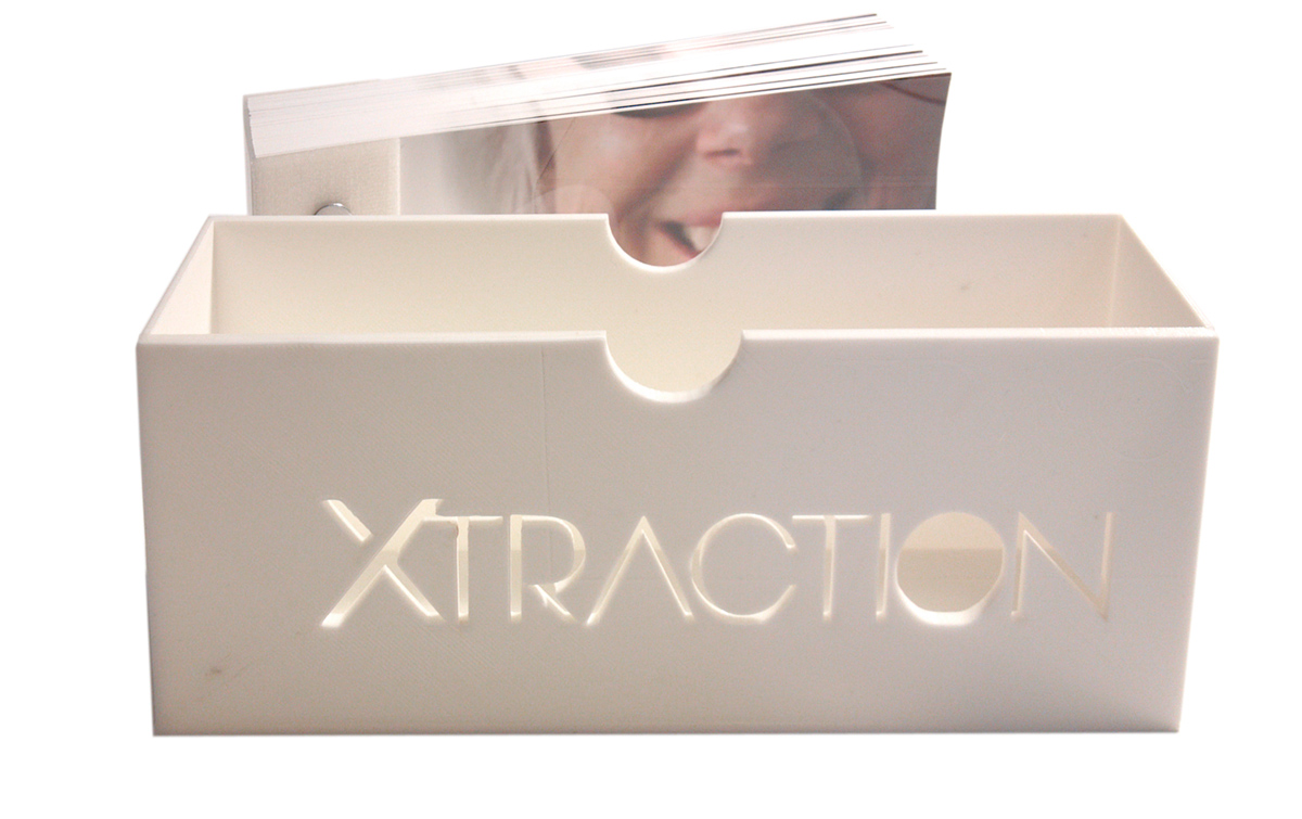
The slipcase for my book Xtraction was also a success. My strategy worked. I’m excited to finish these projects. J'ai le vent en poupe ! I’m on a roll! as they say. I will elaborate on this project later, but here is a photo of the result of the last 3D print of Xtraction's slipcase.

© 2016, Louise Levergneux, 3D printed slipcase for Xtraction


Last week we visited the compelling Clock Drawings by Adrian Göllner. One more drawing from the series is worth looking into because of it’s interesting history.

The MGM blockbuster movie Ben Hur made its screen debut in 1925. Borrowing on its success, the Westclox Clock Company designed a handsome, roman-style alarm clock, which they called the Ben Hur and began marketing in 1927. The Ben Hur clock in my collection was purchased at Rideau Antiques in the Ottawa Valley, so it had likely been the property of a farm family in the vicinity. A mark on the reverse indicates that it had been serviced in 1942, but sometime after that it ceased to run and a repairman scavenged its winding keys. The clock is in poor condition and the spring was broken, but the alarm spring was still partially wound. I suspended the clock movement above a piece of carbon paper and then triggered the alarm. The alarm hammer struck the surface for several seconds. A decidedly men’s-style alarm clock, one might conclude that it was a birthday or Christmas gift for the father of a household. Perhaps he had traveled to the big city, seen the movie and now his family honoured him with a clock of the same name. If that is the case, then memories of the movie and thoughts of his family were an inextricable part of the energy coiled on the alarm spring and which made the marks upon the paper.

© 2010 Adrian Göllner

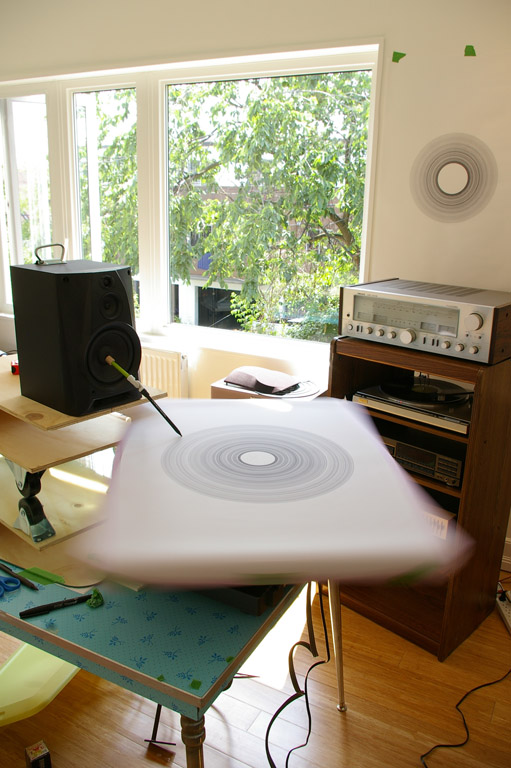
Another series, another device. Adrian’s project the Norwegian Wood Drawings configures a turntable so that the vibrations of the needle are transferred onto a drawing surface.

© 2012, Adrian Göllner, Norwegian Wood Drawing Mechanism

© 2012, Adrian Göllner, Norwegian Wood Drawing Mechanism

 A vinyl recording plays on the turntable causing the speaker’s woofer and attached pen to vibrate. The pen is slowly drawn backward across the drawing surface that itself rotates at 33 1/3 rpm.

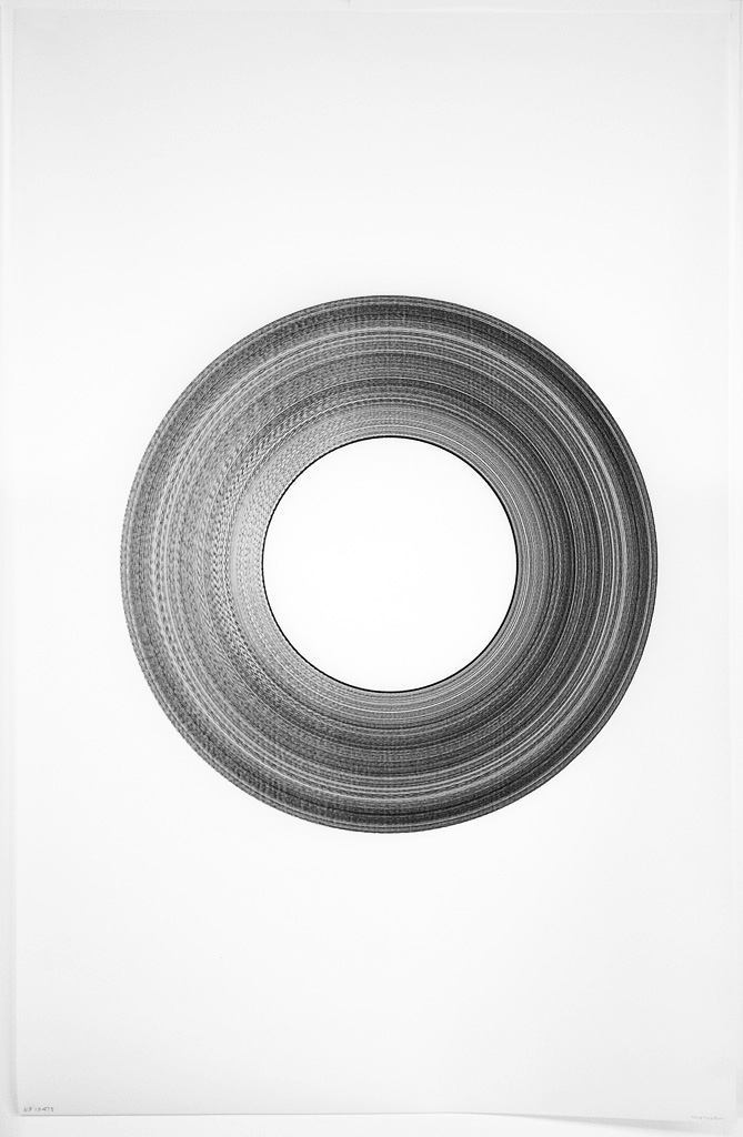
Adrian’s intention was to divine the shape of John Lennon's loneliness from the grooves of his old Beatles albums. 

“A brilliant but troubled song songwriter, rejection and self loathing underlie many of Lennon's most enduring songs: Girl, I'm a Loser, Help and Norwegian Wood. Speculative? Absolutely. But even the consideration that the lines before us contain the essence of John Lennon’s loneliness make these drawings both curious and compelling.”—Adrian Göllner

© 2012 Adrian Göllner, Come Together, ink on vellum, 34 x 22 inches

© 2012 Adrian Göllner, Come Together, ink on vellum, 34 x 22 inches

© 2012 Adrian Göllner, I Want You, ink on vellum, 34 x 22 inches

© 2012 Adrian Göllner, I Want You, ink on vellum, 34 x 22 inches

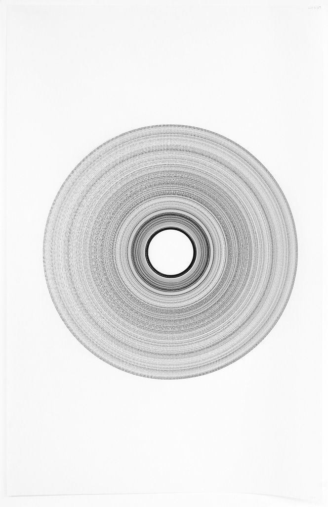
© 2012 Adrian Göllner, Across the Universe, ink on vellum, 34 x 22 inches

© 2012 Adrian Göllner, Across the Universe, ink on vellum, 34 x 22 inches


The studio of James G. Jenkins is part of the Water Street Studios an artist co-op in Batavia, Illinois. Lucky to meet this talented artist, luckier to have him as a friend.

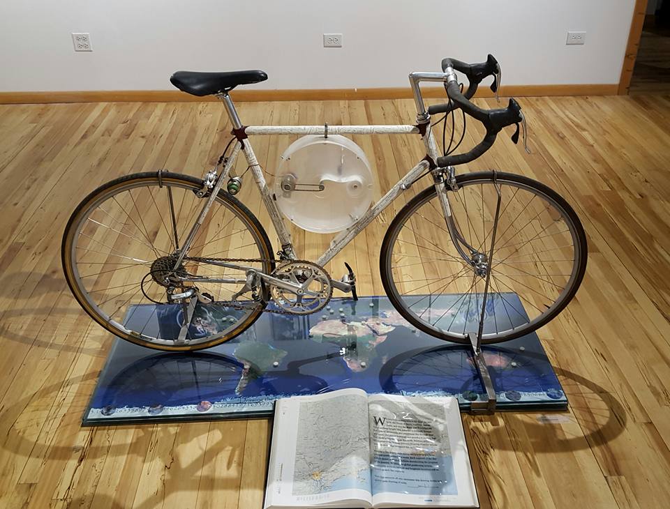
Drawing the Line(Somewhere) was made on one of the many bicycle paths around Batavia, Illinois. The reason for building this device was to "connect the dots" around the world to all areas suffering from climate & environmental problems. "We all must "draw the line" on something," says Jenkins. I use this device and performance to demonstrate it. 

© James G. Jenkins, Drawing the Line(Somewhere)

© James G. Jenkins, Drawing the Line(Somewhere)

James also notified the Museum of Contemporary Art in Chicago that he would be "drawing rings around them." This drawing is from that performance.

© 2004-2006 James G. Jenkins,  Drawing the Line(Somewhere), detail of drawing 

© 2004-2006 James G. Jenkins,  Drawing the Line(Somewhere), detail of drawing 

James’s sculptures provide a theme for both intellectual and visual curiosity. They contain road maps directing the observer through a process of distillation and fusion of contrasting ideas and investigative humour. James a genius at work is always happy to show you around his studio and direct you to the actual installations around Illinois. If you are in Illinois, James's studio is worth the visit!


These wonderful well thought out art pieces leave me with deep thoughts...

Drawing

Would you like to delegate certain tasks?

My work exhilarates me and I enjoy the activities in my studio. Certain activities are monotonous repetitions. After a day of these, I get cross-eyed. 

The learning curve with Tinkercad is more work than I assessed. I have figured out how the Ultimaker 2 3D printer handles measurements depending on heights and widths. I have redrawn my prints so many times...did I mention redo, redo, redo and redo! Oh! and re-measure. An Epson or an Ultimaker 2, Aargh!

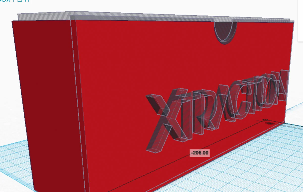
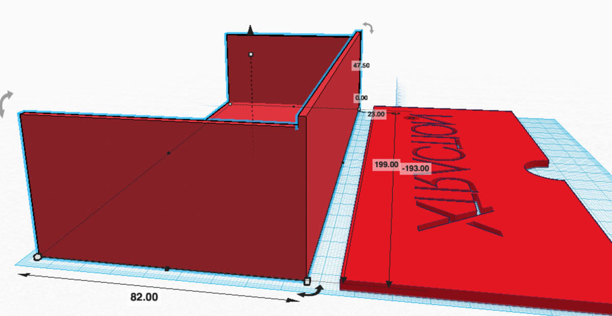
As simple as my Tinkercad drawings are they are difficult to print. I should job out this task for sure! There were changes and savings too numerous to illustrate. Here are a few images that show the steps I took to break down the slipcase into two pieces to print. The last drawing is ready for print. Let's see if this works!

© 2016 Louise Levergneux, 3D printed slipcase for Xtraction

© 2016 Louise Levergneux, 3D printed slipcase for Xtraction

© 2016 Louise Levergneux, 3D printed slipcase for Xtraction

© 2016 Louise Levergneux, 3D printed slipcase for Xtraction

© 2016 Louise Levergneux, 3D printed slipcase for Xtraction

© 2016 Louise Levergneux, 3D printed slipcase for Xtraction

© 2016 Louise Levergneux, 3D printed slipcase for Xtraction

© 2016 Louise Levergneux, 3D printed slipcase for Xtraction

© 2016 Louise Levergneux, 3D printed slipcase for Xtraction

© 2016 Louise Levergneux, 3D printed slipcase for Xtraction


Do you thrive on endless repetitions? Is it meditation?

Which experience is worse drawing in Tinkercad or Miguel Endara’s pencil touching the paper 32 million times to create Hero?


Karina Smigla-Bobinski gave the task of drawing to the audience that came to play with her kinetic sculpture installation.

ADA is a post-industrial "creature" self-forming artwork. She is a 3m diameter PVC balloon performance machine and her patterns of lines and points, get more and more complex as the number of people playing increases. What an experience this must have been! 


Adrian Göllner, an installation artist who collects old wind-up alarm clocks. Compelled by the energy stored in the spring of over-wound clocks, Adrian channelled this found energy into drawings. 

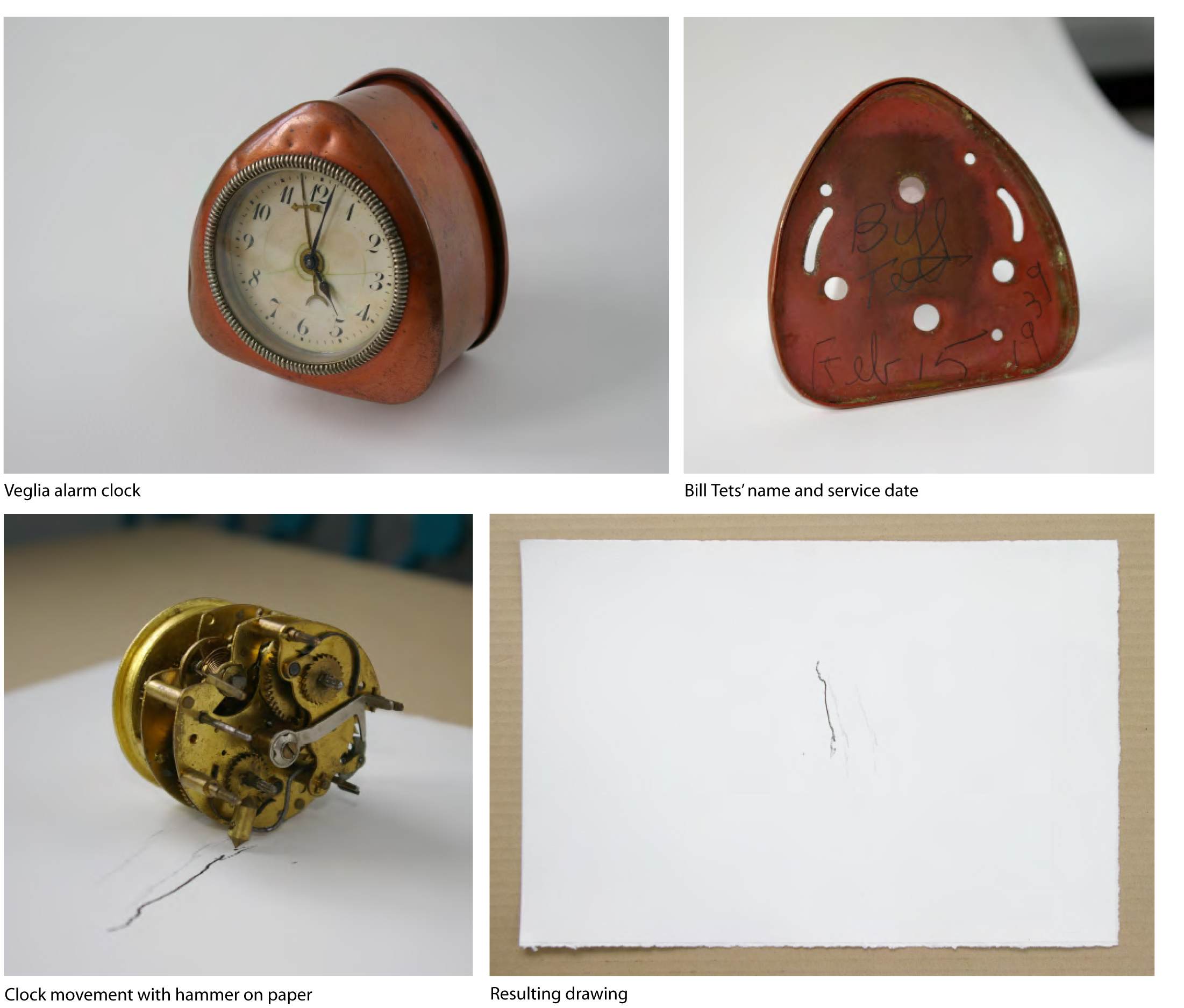
The Clock Drawings were either created by the clock’s movement, which was directly set atop a piece of carbon paper, or the movement was suspended just above the carbon paper. In both cases, when the alarm spring was released, the hammer struck the surface and made a mark.

Each clock used to create a drawing had its own particular temperament. Getting a clock to run continuously or convincing it to give up the energy bound on its alarm spring often required a specific apparatus. As a result, the weight of the drawn lines and the size of the paper vary considerably. Each drawing is presented in simple box frame and accompanied by a one-page account of the drawing process and Adrian’s suppositions about the clock owner’s circumstances.

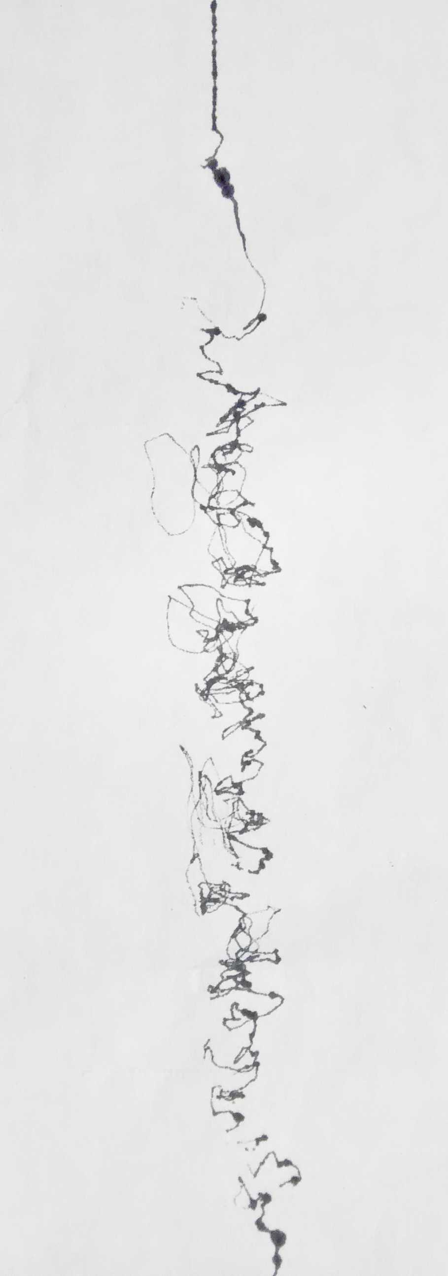
The first of the alarm spring drawing was created using an old Italian Veglia alarm clock. When released, the alarm hammer struck the surface of the paper so vigorously that it dragged the movement for 3.5cm. 

“The person to last service the old Italian Veglia alarm clock had written his name and a date on the inside of the clock case, which allowed me to conclude that I had just witnessed and recorded Possibly the Last of Bill Tets, Clock Repairman,” as narrated by Adrian.

© 2009-2011 Adrian Göllner, Possibly the Last of Bill Tets, Clock Repairman

© 2009-2011 Adrian Göllner, Possibly the Last of Bill Tets, Clock Repairman

To facilitate another clock drawing, Adrian partially disassembled the clock and prepared a piece of paper to fit over the face. He then started the clock, fitted the piece of paper and replaced the minute hand of the clock. Glued to the minute hand was a small pencil lead. Powered by the winding motion of an old farmer’s hand some seventy or eighty years ago, the lead was dragged across the surface of the paper for a period of 3.86 hours.

© 2009-2011 Adrian Göllner, 1919 Westclox Big Ben, Style 1A Alarm Clock

© 2009-2011 Adrian Göllner, 1919 Westclox Big Ben, Style 1A Alarm Clock

These drawings intrigue me, the straightforwardness of the idea gives me chills, brings me back to old history. The drawings are pure and the energy is strange and yes, Adrian ghostly.


What could I devise to help with the monotonous tasks still ahead? How does an artist rethink the process or think minimalism?

Simplicity is best, but for right now my new project needs its final feature to be complete!

Entrepreneur

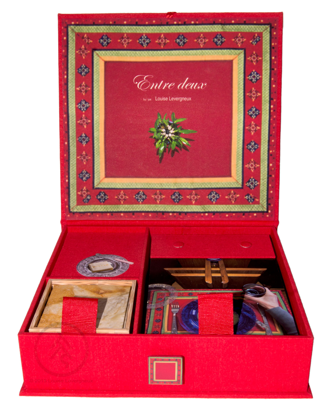
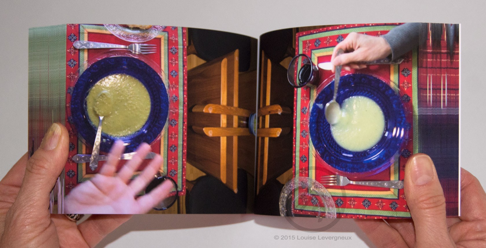
The weeks are flying by and I’m still hard at work finishing my book Finding Home. A looming deadline is approaching and panic is at play. As I fold over the last page, I’m reminded of my artists’ book Entre deux. A project that includes Turkish map folds in an accordion book and a flip book. Entre deux is an interactive documentary inviting the viewer to partake in a simple meal with a couple while being privy to the couple’s conversation on love. 

I created Entre deux for the exhibition FEAST at 23 Sandy Gallery. I chose the accordion book and flip book format to give the viewer a sensory experience. By flipping the pages the viewer is part of the meal. While unfolding the Turkish map folds—breaking bread, the viewer takes part in the conversation.


© 2013 Louise Levergneux, Entre deux

© 2013 Louise Levergneux, Entre deux

© 2013 Louise Levergneux, Entre deux

© 2013 Louise Levergneux, Entre deux

© 2013 Louise Levergneux, Entre deux

© 2013 Louise Levergneux, Entre deux

© 2013 Louise Levergneux, Entre deux

© 2013 Louise Levergneux, Entre deux


In my studio, I am the initiator of each project, I hold the post of artist, photographer, author, designer, binder, printer, publisher, webmaster and lets not forget blogger.

In college, I explored the business side of my chosen career but never thought of wearing so many hats! No clue, that was me in college!

Beginning to live in reality, entrepreneurship revealed itself. Entrepreneur in English is pronounced—ahn-truh-pruh-noor, in French—an-tre-pre-neûr, and in any language—doing business alone

 • Founder and administrator of my domain, I handle each and every activity. 

 • Contractor and labourer, I organise and manage my time. 

 • Even as executive in charge, a raise is unattainable. 

 • I love being im.pre.sa.ri.o; but often can’t finance my work. 

 • Being an accountant gives me prestige, but the money isn’t multiplying.

 My policy is to market, advertise and promote my work six months out of the year. Good luck with that! 

Why do it, it’s part of who I am? Without my art I am lost. So, I continue the roller coaster ride of being an artist—life filled with wonder at the next idea or creation.

My first grade teacher—an avid drawer, inspired our class by drawing a new image every week on the chalk board. Rachel Lemire noticed my talent for art. Who discovered yours, your first grade teacher or Ellen Degeneres?

How do you do it? I would be interested in knowing your recipe for a successful artist career.

Oh! the day is passing and I need to print more pages...


Prints, Prints and Printing, Part 2

Last week, I met two eclectic artists—best evening in a long time. It was a stimulating conversation on printing, the process, the frustrations and the wonderful results. 

Our talk continued as we discussed my last blog post Prints, Prints and Printing. It gave us food for thought on how we label our own final products as artists and photographers. 

This week, part 2 of my post on printing, I’m showcasing prints by artists/photographers who use different printing methods.

Let’s start with a Pigment Inkjet Print of my new artist book Conversation printed on an Epson Stylus Photo R3000. Conversation is a limited edition of 3.

© 2014 Louise Levergneux,  photo detail of artists' book Conversation

© 2014 Louise Levergneux,  photo detail of artists' book Conversation


I met Betty Mallorca and Lawrence Manning at a Treasure Valley Artists’ Alliance exhibition. Both are photographers and founders of Hill Street Studios and TRACK 13 in Nampa, Idaho. Betty and Lawrence have many years of experience in commercial and professional photography, art direction and graphic design. They are contributors and part-owners of Blend Images, a multicultural commercial stock agency. 

Betty printed her limited editions on an Epson 3800. Almost Home (copy 1 of 10) and Ghostly Passage (copy 1 of 10) both are mixed media—Giclée and colored pencil prints.

© 2016 Betty Mallorca, Almost Home

© 2016 Betty Mallorca, Almost Home

© 2016 Betty Mallorca, Ghostly Passage

© 2016 Betty Mallorca, Ghostly Passage

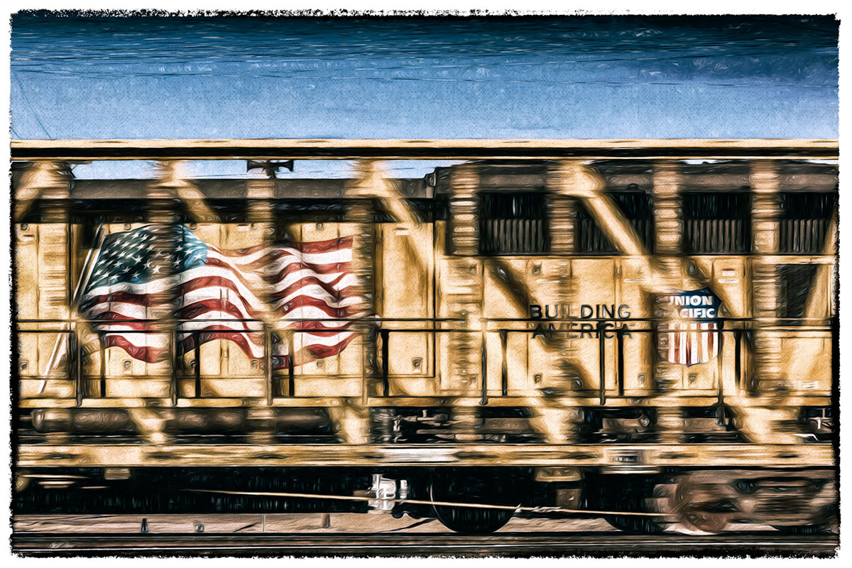
Lawrence printed his photos on an Epson 3880. 5885 Rodeo study #2 and 5655 Depot Study Two are Digital Pigment Prints.

© 2016 Lawrence Manning, 5885 Rodeo study #2

© 2016 Lawrence Manning, 5885 Rodeo study #2

© 2016 Lawrence Manning, 5655 Depot Study Two

© 2016 Lawrence Manning, 5655 Depot Study Two


I met Diane Ronayne when I emailed my move to Boise on the Book Arts listserv. Diane is a freelance editor for books and manuscripts and writer for magazines and newspapers; but her passion is photography.

Diane's Archival Color Print Angry Rabbit was printed on an Noritsu wet-lab printer, model OSS-3411.

© 2015 Diane Ronayne, Angry Rabbit

© 2015 Diane Ronayne, Angry Rabbit


In 2010, after my move to Utah, I communicated with Laura Russell owner of 23 Sandy Gallery in Portland, Oregon. Laura is a photographer and book artist who creates hand-bound, limited-edition artist books. Her books incorporate photographs of urban landscape and tell a story about our culture and our communities. Laura works under the imprint Simply Books, Ltd.

Laura's flag book Hit the Road! was printed on an Epson R2400. The flags/pages of this limited edition artists' book are Archival Digital Inkjet Prints. Hit the Road! is volume one in a series featuring Washington, Oregon and California. The artist spent close to three years traveling Highway 99 to photograph and catalog roadside attractions.

© 2011 Laura Russell, Hit the Road!

© 2011 Laura Russell, Hit the Road!

© 2011 Laura Russell, Hit the Road! detail

© 2011 Laura Russell, Hit the Road! detail


Ellen Crosby a member of the Treasure Valley Artists’ Alliance was introduced to me by Diane Ronayne. Ellen is a dedicated landscape photographer, proven by her 150 sunsets chronologically recorded during 2012.

Ellen worked with fellow photographer Ann Lindell to create this appropriated and altered Inkjet Aqueous Archival Pigment Print Ann's Cat Photo for her series Teeny Abstracts.

2015  Ann Lindell/Ellen Crosby, Ann's Cat Photo

2015  Ann Lindell/Ellen Crosby, Ann's Cat Photo


Vera Greenwood’s contemporary art practice is subjectively personal, placing emphasis on story telling, record keeping, social studies and a conceptual approach to representing the everyday. Her installations have always incorporated text—bookworks became a logical extension of her art practice. Oh! by the way Vera is a dear friend and our conversation on art is always stimulating.

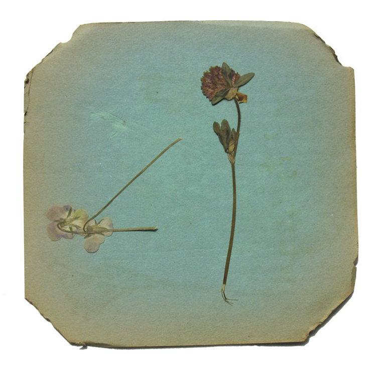
Vera's photographs of sheets of blotting paper with fragments of leaves and/or petals are Giclée Prints. The Flower Press project was printed on an Epson 9900.

© 2013 Vera Greenwood, Flower Press 1

© 2013 Vera Greenwood, Flower Press 1

© 2013 Vera Greenwood, Flower Press 2

© 2013 Vera Greenwood, Flower Press 2

© 2013 Vera Greenwood, Flower Press 3

© 2013 Vera Greenwood, Flower Press 3


Going beyond the codex format for my artists' books, I wanted to create other book structures. I met Karen Hanmer through her article and great tutorial on the flag book structure in The Bonefolder: an e-journal for the bookbinder and book artist. Karen’s artist-made books are physical manifestations of personal essays intertwining history, culture, politics, science and technology. What attracted me to Karen’s work is the often playful content she uses.

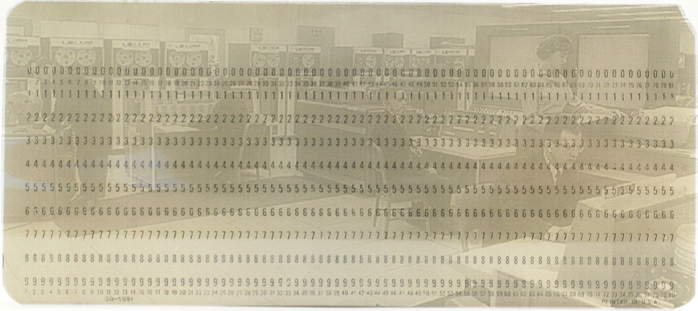
Karen printed Big Blue with an HP LaserJet 1320. The edition of 100 computer punch cards are Laser Prints on polyester film.

© 2006 Karen Hanmer, Big Blue

© 2006 Karen Hanmer, Big Blue

To Serve and Protect: Containers, conveyances, and cosmic happenings was printed with an Epson Stylus Pro 4000. The artists' book has 32 Pigment Inkjet Prints/pages. In this artists' book the artist’s muses on life in the 1960s and 1970s.

© 2014 Karen Hanmer, To Serve and Protect, page spread of Mood Ring

© 2014 Karen Hanmer, To Serve and Protect, page spread of Mood Ring


In 2012, at the Guild of Book Workers’ Standards of Excellence conference in Utah, I met Andrew Huot. The more Andrew described his books the more I was intrigued. Andrew, a bookbinder, conservator, and book artist originally from Toronto, Canada, is owner of Big River Bindery. Andrew looks at everyday situations and enjoys observing the world's small, passed-over details.

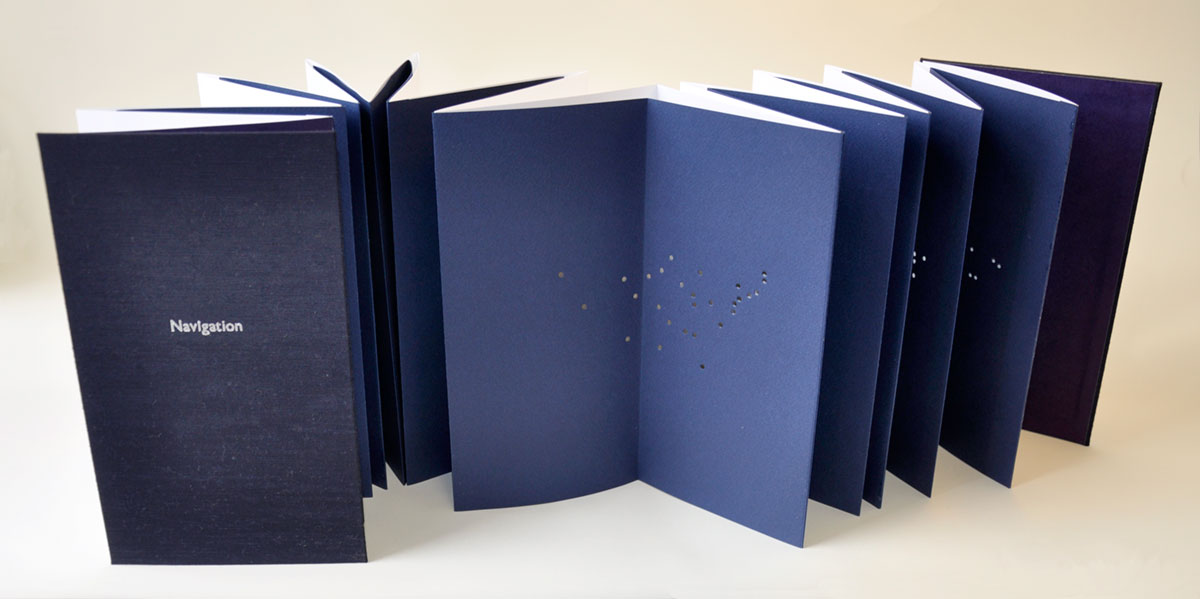
Andrew's artists' book Navigation is Letterpress printed on colored paper with hand-cut holes, bound in cloth-covered boards. Navigation, a carousel book that spans over 8 feet when opened guides the artist’s family to their next destination.

© 2009 Andrew Huot, Navigation

© 2009 Andrew Huot, Navigation

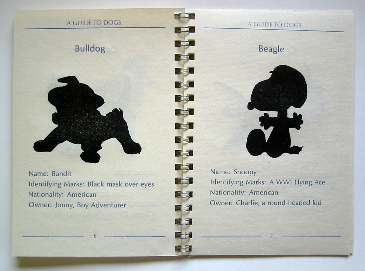
A Guide to Dogs is also Letterpress Printed with handset type, linoleum cuts, and photopolymer plates. This humorous guidebook helps to identify Man's Best Friend with silhouette drawings and vital information for each breed.

© 2008 Andrew Huot, A Guide to Dogs

© 2008 Andrew Huot, A Guide to Dogs

© 2008 Andrew Huot, A Guide to Dogs

© 2008 Andrew Huot, A Guide to Dogs


A studio is more than four walls filled with equipment and tools. An artist needs creativity, ideas, time, research and contacts to achieve a piece of work. Communication and sharing brings a different facet to an artist’s world. I’m always grateful for any discussion on art or someone’s opinion or critique. My work thrives when these elements are part of my world.

Thanks to everyone who shared their work this week!

It is late... going back for more ideas!

Prints, Prints and Printing

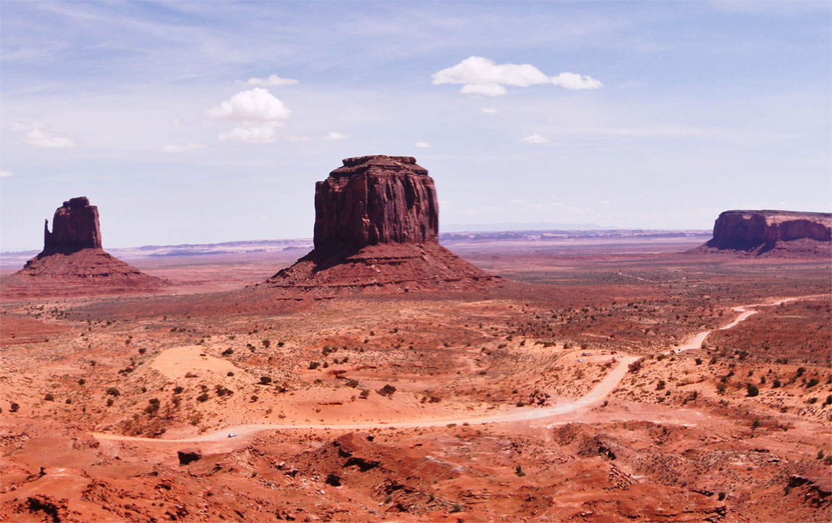
It's February and Canyonlands National Park is the place where my mind keeps traveling to.

© 2011 Louise Levergneux, Mesa Arch, Island in the Sky

© 2011 Louise Levergneux, Mesa Arch, Island in the Sky

Back to reality, at a Treasure Valley Artists’ Alliance art show, Lawrence Manning's wonderful print caught my eye and I noticed the term on the label of the piece. I thought it interesting as I was reading an article on how prints should be labelled, a controversy on naming prints now days. This brought me to research more on the correct technical names for prints.

© 2016 Lawrence Manning

© 2016 Lawrence Manning

There are so many ways to label prints it gets very confusing. Digital Print, Giclée Print—short for une épreuve giclée, Iris Print, Inkjet Print, Pigmented Ink Print—the list goes on.

Giclée Print, (which has negative connotations these days—not sure why), and Inkjet Print are the same. These prints are created by spraying ink through microscopic nozzles on a variety of surfaces or media from a digital-based image. A Master Printer told me, that if you have an inkjet archival printer, then the output from that printer is considered a Giclée or Inkjet Print because of the system used by the printer. 

Inkjet Printer

Inkjet Printer

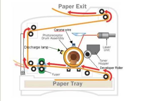
When using a laser printer, the prints are created using a toner cartridge filled with fine powder and a heated fuser. Galleries may have a hard time with the archival and quality of these prints that are not considered Inkjets Prints or Giclée Prints. 

Laser Printer

Laser Printer

Giclée has become synonymous with fine art reproductions with pigmented inks. Most photographers selling inkjet prints refer to them as “photographs” or Inkjet Prints. A giclée print is said to begin with a high-quality digital file, either from scanned film, digital capture or computer. Printers that output Giclée Prints are calibrated in a closed-loop colour management system using inkjet with archival pigmented inks. Some people say that these outputs/prints need to be printed by a Master Printer, who understands colour theory and imaging software. 

I often hear the term "Pigment Ink Print" which defines the type of ink used. If your printer has dye inks, then your output is a Dye Ink Print. It is straight and to the point and both terms are archival by definition and need no further explanation.

The term Digital Print or Digital Pigment Print may be a problem for those whose prints begin with film. The word digital is used when one starts with a digital file.

I have not yet seen a site that has published a universal agreement or naming convention for prints. Labelling should start with the printer used.

Laser and Inkjet are the two prime technologies that find widespread applications today. Laser printing is unbeatable when it comes to high text quality printing. While inkjet printers serve photographers and artists who are primarily focused on photo printing. The classifying of your prints should explain the ingredients that make up the print. Your printer determines how to label a print or output.

I find it good practice to specify the process, printer and paper types used to create my artists’ books. The artist should always communicate to a potential buyer the process in which a print is made and disclose the quality materials used. 

Content with my research, I sat at my desk with brain cells on fire and my creativity exploding. I felt great! Then the printing stage of my project came along and everything turned into a major frustration. Adding to the shame of sending out the same blog post three times with MailChimp this morning. My Epson Stylus Photo R3000 no longer feeds paper or it does when it wants. Oh! same problem as the first R3000 I purchased. What a day @&%$#@. My Epson 2200 and my refurbished Epson R3000 printers retired and happy with themselves sit in the corner of my studio. Another dilemma!! 

Stonewalled by my printers. AYE!!!!!

Have you ever wanted to throw your printer out the window? If yes, never place your printer near a window—it’s too tempting!

This video is hilarious and fills me with laughter and joy!! I guess I’m not the only one with printer problems.

Watch closely at the little printer icon that keeps popping on the right side of the video screen. Been there, hate the popping icon, it’s not good news!

The printer companies are money centric and no longer customer centric. We don’t need famous printer ads, we need a good printer that lasts. I have my eyes on you EPSON!!


So... what to do… maybe I will go back to Moab at least in my mind's eye!

© 2011 Louise Levergneux, Red Cliffs Lodge

© 2011 Louise Levergneux, Red Cliffs Lodge

A looming deadline... where do I print my pages?

Flip Books and 3D Printing

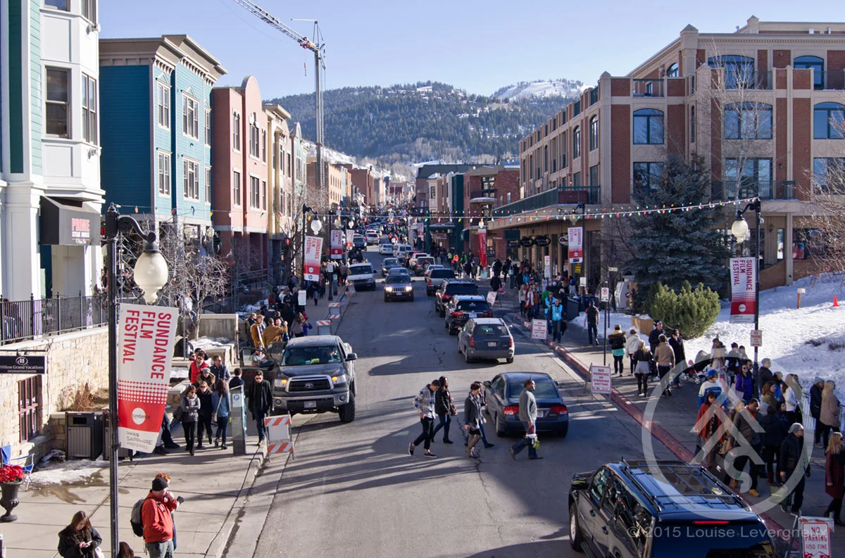
I found one thing I miss from living in Utah, the Sundance Film Festival in Park City. I took this photo in 2014 on our annual–go see what it’s all about—visit. We had the opportunity to say hello to Sam Shepard and to Gilles Marini.

© 2014 Louise Levergneux, Sundance Film Festival

© 2014 Louise Levergneux, Sundance Film Festival

Getting back to the work at hand. It’s difficult to keep the processes and steps straight with three projects on the go, no four! 

I’m waiting for an order of paper to finish the last two copies of my book entitled Conversation. After two months, finishing these copies with my notes might be a challenge!! 

Meanwhile, I’m tinkering with Tinkercad for my second book entitled Finding Home. An emotional project that tackles my experience of living in Idaho while still rooted in Canada... I will discuss the many changes and end product later.

I am learning the ins and outs of 3D printing and enjoying the sculptural facet of the process. A third print is happening today and will take nine and a half hours to print over 497 layers. Fascinating!

I thought it might be fun to sit and take photos as my object was printing till I saw this timelapse video of a Ultimaker 2 printing a deer. Have you ever heard the expression “it’s like watching paint dry”

The binding and slipcase for my artists’ book Xtraction is also in the queue to be 3D printed, hurray!

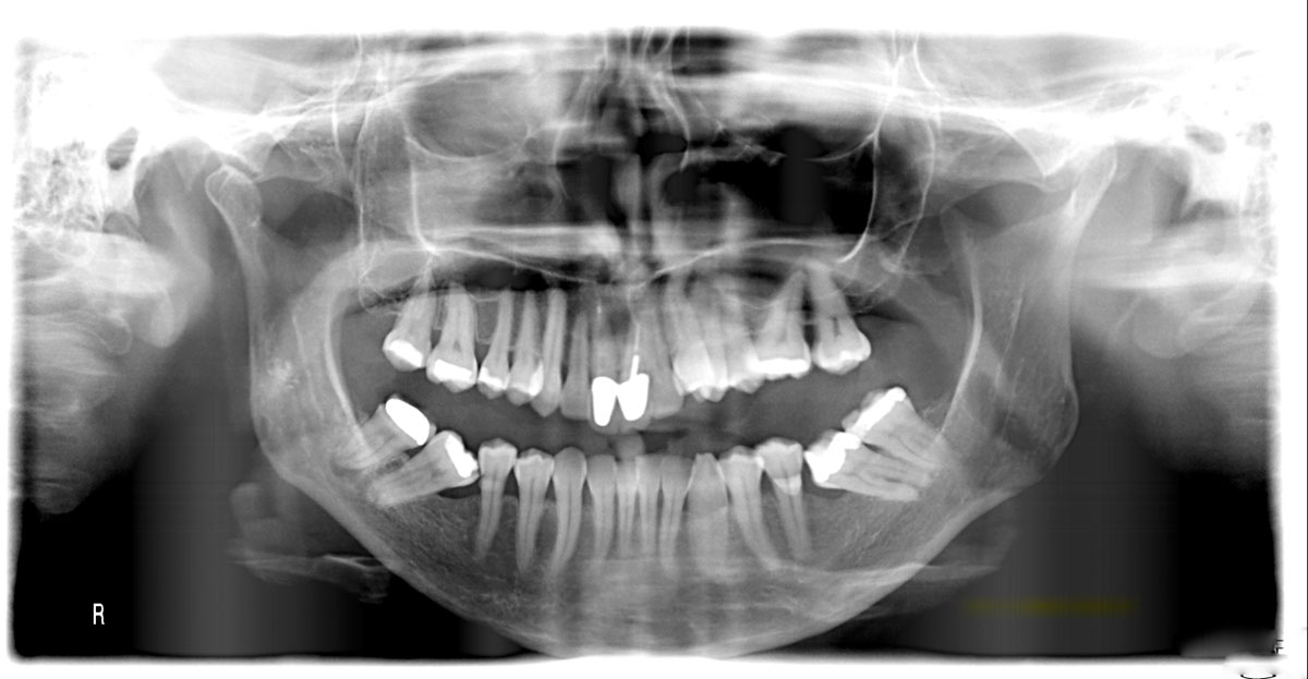
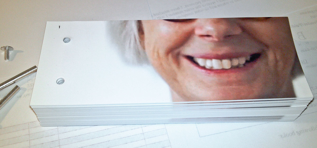
While we wait for paper and prints, lets look at the steps it took to create the flip book for Xtraction. The idea grew from this X-ray. In this instance I used a mix of stills and video taken with my Sony D-SLR.

© 2013 Louise Levergneux

© 2013 Louise Levergneux

 1. First, the stills are manipulated in Photoshop and the video manipulated in iMovie

2. Next, I import the frames from the video into layers in Photoshop

3. Once, the layers are all chosen and sequenced, they are resized into another Photoshop template, I number all the pages—yes, number, it makes it easier to sort. Have you ever had 120 unnumbered pages fall to the floor and not knowing the sequence? I have! FUN! FUN! FUN!

4. All the adjustments in the next step is great fun for people with OCD, as all the layers have different opacity between bottom and top layers for each group of images. The flip book has 120 pages counting the colophon

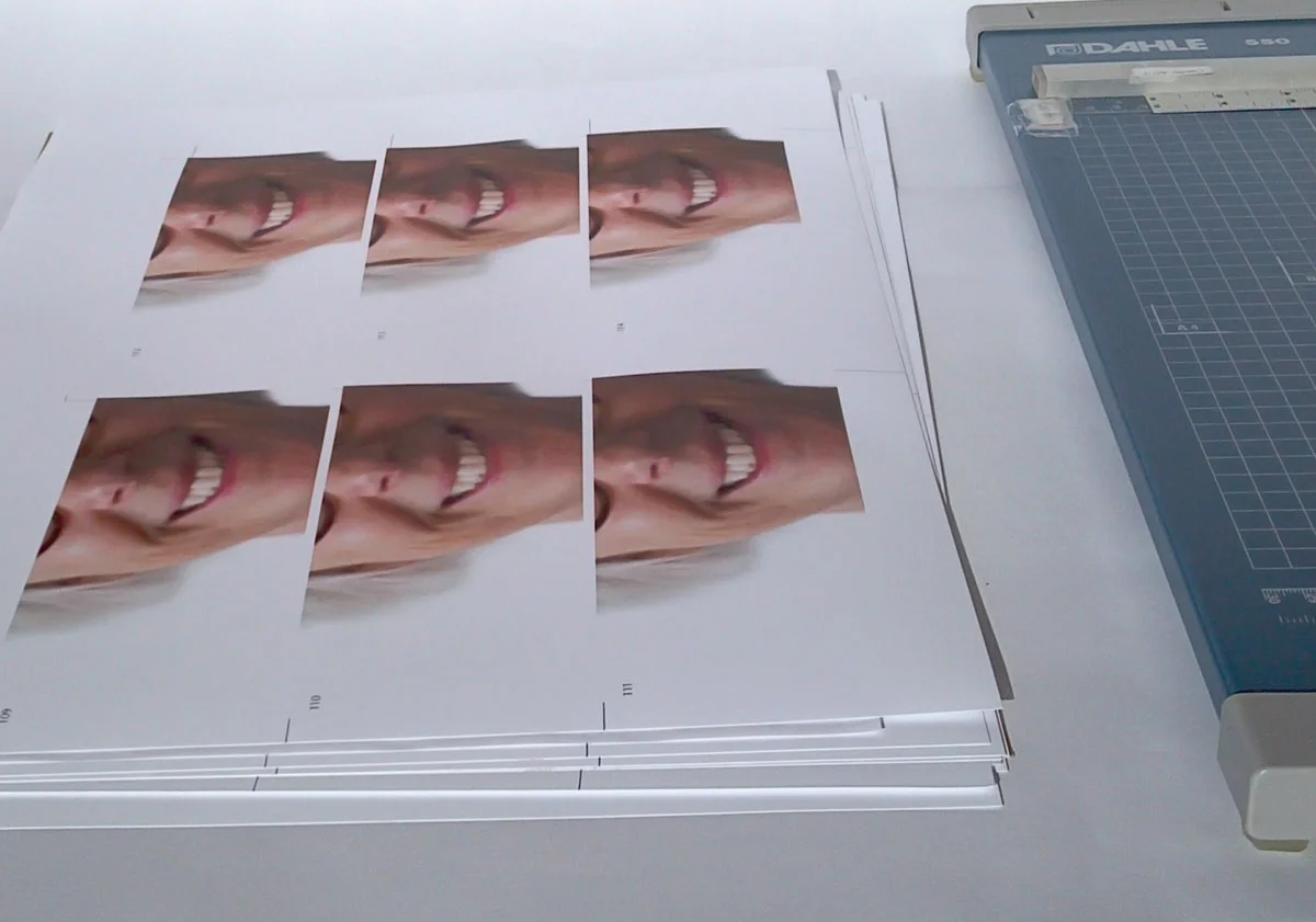
5. Shown are 13" x 19" sheets of pages in Bridge ready for print

© 2014 Louise Levergneux, Xtraction

6. My printer co-operated, thank God! This does not always happen, everyone knows that! I start the cutting phase after the sheets rest for 24 hours. This time relaxes the paper and removes any curling from wet ink. Dried ink allows the paper to be handled without concerns 

© 2014 Louise Levergneux, Xtraction

© 2014 Louise Levergneux, Xtraction

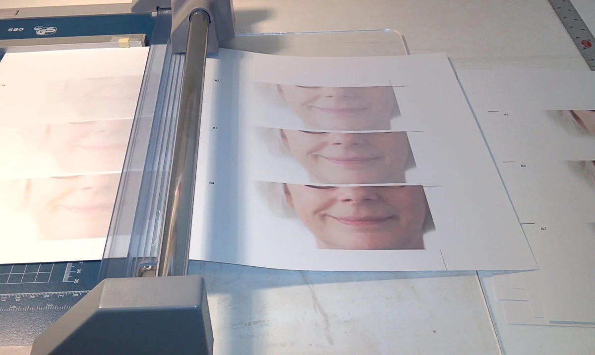
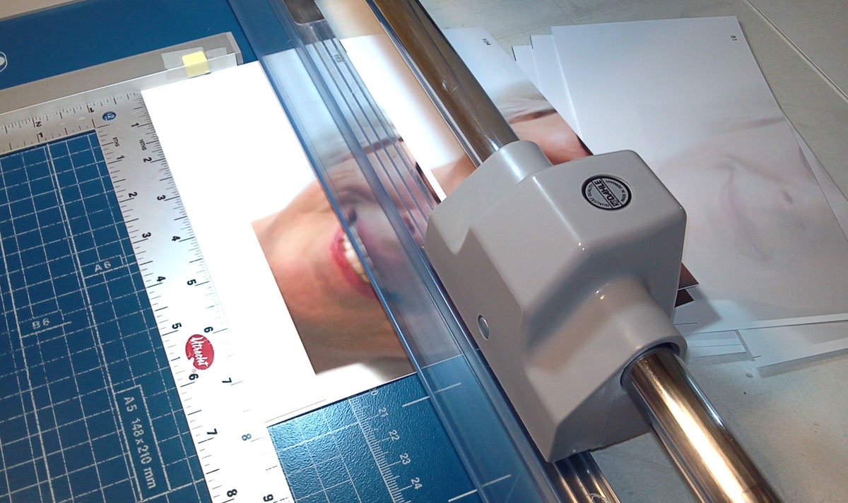
7. Each page goes through a five steps cutting process, this ensures perfect placement of image on each page. The time taken in properly cutting each page properly gives a smooth action when flipping pages. I know these steps by heart after cutting pages for 156 flip books in the last 3 years. First cut is done by dividing the sheet in half.

© 2014 Louise Levergneux, Xtraction

© 2014 Louise Levergneux, Xtraction

© 2014 Louise Levergneux, Xtraction

© 2014 Louise Levergneux, Xtraction

The second cut is done by following the cutting lines for the top of each page.

© 2014 Louise Levergneux, Xtraction

Making sure that all the pages are trimmed at the exact same place on the right edge is the third cut.

© 2014 Louise Levergneux, Xtraction

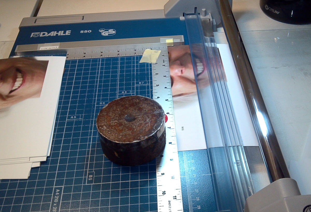
The fourth step is to properly cut the bottom of each page by using a straight edge that will not move.

© 2014 Louise Levergneux, Xtraction

© 2014 Louise Levergneux, Xtraction

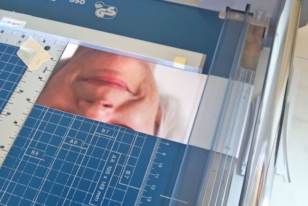
The last and fifth cut is the left side with a pre-determined length for the flip book.

© 2014 Louise Levergneux, Xtraction

I sort and stack, then punch holes through the pages to receive screw posts

© 2014 Louise Levergneux, Xtraction

© 2014 Louise Levergneux, Xtraction

A small binding with cloth over boards is usually cut and assembled to finish the book. Xtraction has a 3D printed binding so this step is omitted

Voilà, one finished flip book. I will have photos of the completed project next week.

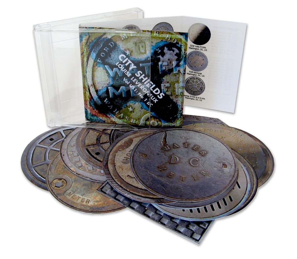
The fourth project I mentioned above is the image manipulation, printing and cutting of the last volumes of City Shields. Forever!

© 2011 Louise Levergneux, City Shields

This will take more than a week, need to get going.


Paper and Folds

The snow is gone and the brown colours are back in Avimor. 

© 2015 Louise Levergneux, Avimor warming up.

Time is flying by fast and since the start of January, I am knee deep in Tinkercad, typefaces, colours and design for my next artists' book. I thought it best to take a breath and visit the BAM, no, not the Brooklyn Academy of Music but the Boise Art Museum. 

Incredible how acronyms have become part of our language. When I moved to Boise, the locals asked if I had visited the BAM—what’s a BAM? For newcomers trying to figure out the lay of the land these abbreviations said à la queueleuleu, remind me of a song.

BAM BAM ROM MoMA,

CoCA GAM IMA,

MAMbo MASS MoCA,

MIA MICA MOCA,

SAM YAM OCMA

Everyone has danced à la queueleuleu, if not this video explains the term

Oops, I’m digressing!

Last Saturday, at the BAM, I saw the exhibition: Paper: the Infinite Possibilities of Origami. This exhibition explores the history of folding and origami as fine art. The pieces in the show were created by 45 master folders from around the world and showcased the power and potential of contemporary origami. Paper is endless creativity in these artists’ hands. I met Alexandra Monjar a friendly and dedicated docent able to give us lots of information on the exhibited works.

The koi by MichaeI G Lafosse caught my eye. The koi were delicate yet strong. Back at home I could not wait to explore more origami work on the Internet, I’m intrigued.

The next video is an introduction to Sipho’s project White Elephant–a life-size 3 metre high origami elephant. 

If you have time the 6 part video on White Elephant is worth it even though it takes nearly an hour to watch—all of them! I'm sure you can speed view at times!

WHITE ELEPHANT Part 1 (8:56 min)

WHITE ELEPHANT Part 2 (13:26 min)


WHITE ELEPHANT Part 3 (4 min)

WHITE ELEPHANT Part 4 (13:48 min)

WHITE ELEPHANT Part 5 (10:03 min)

WHITE ELEPHANT Part 6 Final (9 min)


These videos brought to mind other artists who create with paper. A good friend, mentor and artist, Francois X. Chamberland, gifted me the bible seen below at the end of the eighties. I still regard it as one of my favourite pieces in our home. I tried my hand at folding and never had the patience to continue.

© 1989 François X. Chamberland

© 1989 François X. Chamberland

Canadian artist Cathryn Miller’s altered books are sometimes filled with Froebel stars–a form of origami that combines folding with weaving. Cathryn’s love for paper can be seen in her altered book Universe / Starry, Starry Night inviting you to play and dream.

© 2008 Cathryn Miller, Universe / Starry, Starry Night

© 2008 Cathryn Miller, Universe / Starry, Starry Night

In Cathryn’s Universe: Foundation Trilogy, a series of altered books made from the pages of Life Nature Library volume "The Universe" pays homage to Asimov's iconic science fiction trilogy. The patience to fold several hundred stars for a project is amazing!

© 2012 Cathryn Miller, Universe: Foundation Trilogy

© 2012 Cathryn Miller, Universe: Foundation Trilogy

The Froebel stars make another appearance in Universe / A Hitchhiker's Guide.

© 2008 Cathryn Miller, Universe / A Hitchhiker's Guide

© 2008 Cathryn Miller, Universe / A Hitchhiker's Guide

You can help Cathryn’s The Wishing Star Project by leaving a wish.

While you are busy wishing, I’m going back to my thoughts and 3D printing ! !