When I finally looked up from my work table the other day, I checked the calendar and cringed. An entire month had slipped by—a blur of endlessly rethinking my paper choices and color swatches for my new project, Eudaimonia.
At this stage in my creative journey, the development phase doesn't always come easily. I used to catch a spark of inspiration, and every step would fall into place seamlessly. Now, I find myself caught in a tug-of-war between my original concepts and the new materials required to bring them to life. Truthfully, this is the hardest part of my process.
How do you navigate that moment in your own creative work when the materials begin asserting their own demands on your original vision?
The Printing Dilemma
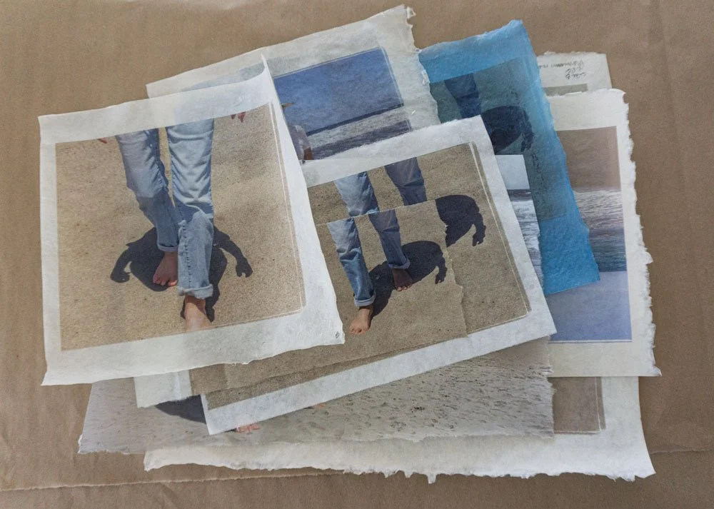
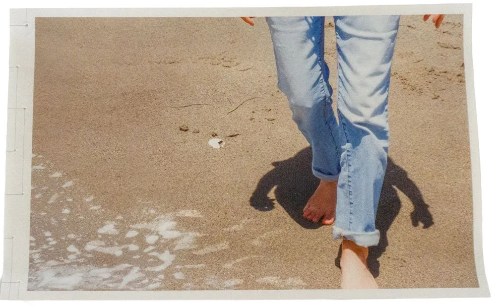
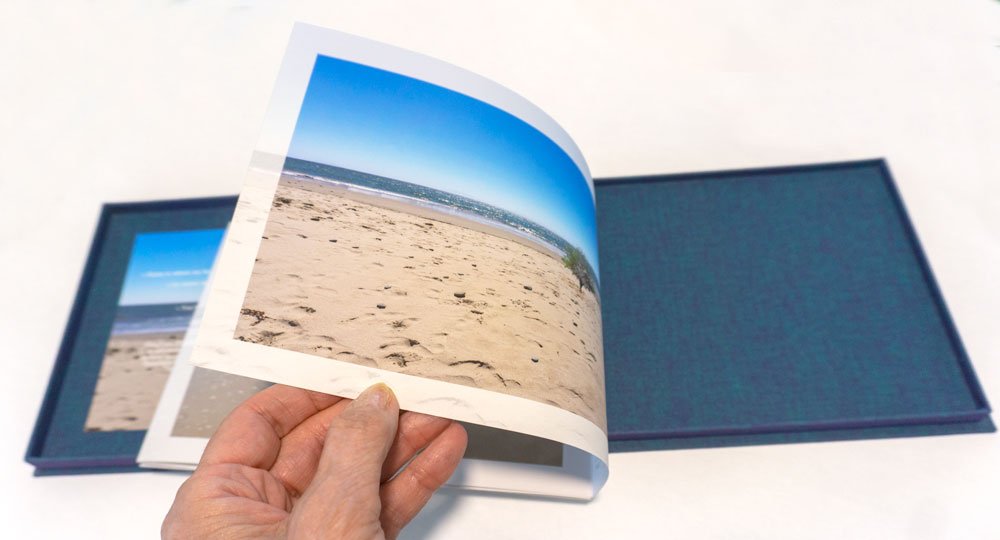
For days now, I’ve been printing color swatches on Asuka paper, yet I’m still not quite satisfied with the results. Getting the ink to play nice with the paper was its own trial; because Asuka paper naturally absorbs so much, I had to carefully fine-tune my settings in Photoshop to prevent over-saturation and bleed. After navigating endless options in the print window, I finally succeeded; the paper no longer curls, and the ink settles beautifully into the paper's delicate surface.
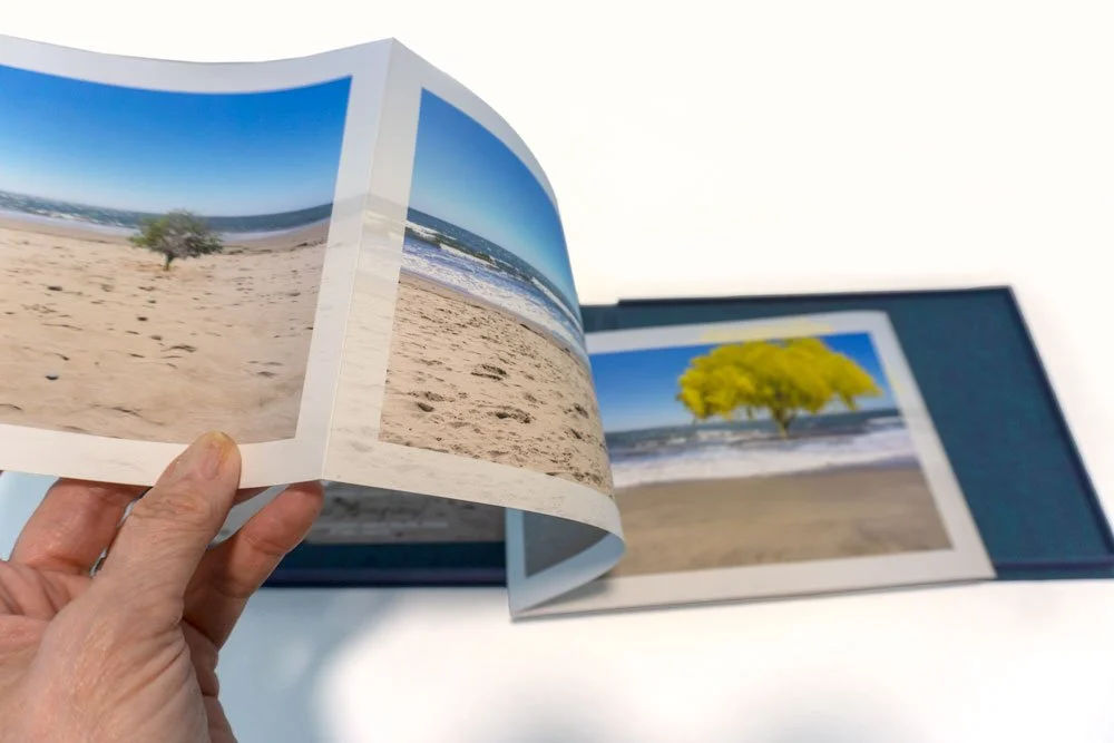
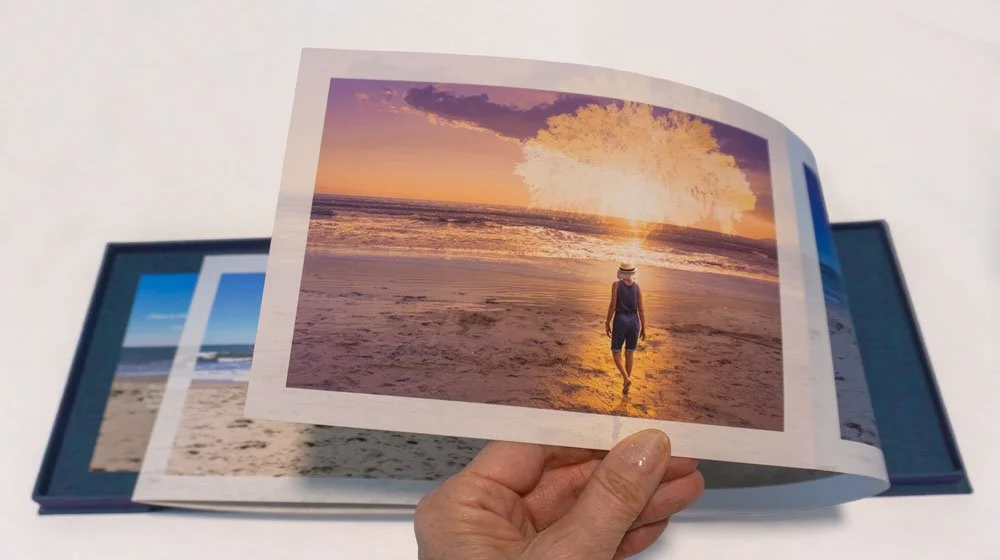
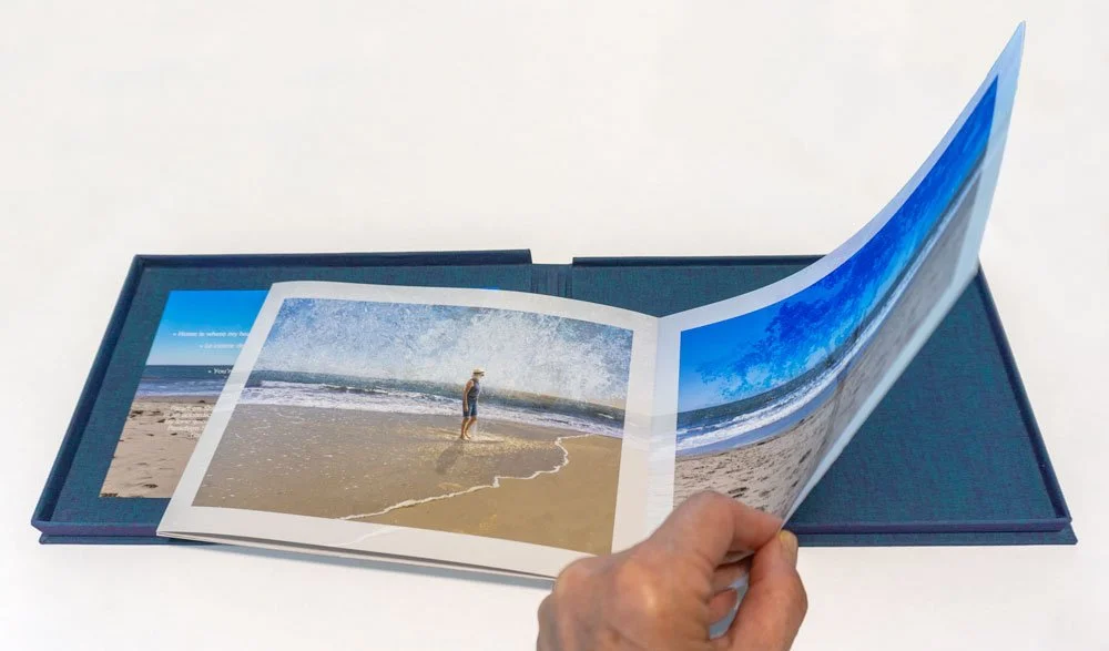
However, after all that effort, a new issue emerged: I have a feeling the 70g Asuka paper from Hiromi Paper isn't quite stiff enough to allow the book to stand upright on its own. That structural support is crucial—the hidden inner folds need to stand firm to reveal the solid blocks of color that drive the emotional arc of Eudaimonia.
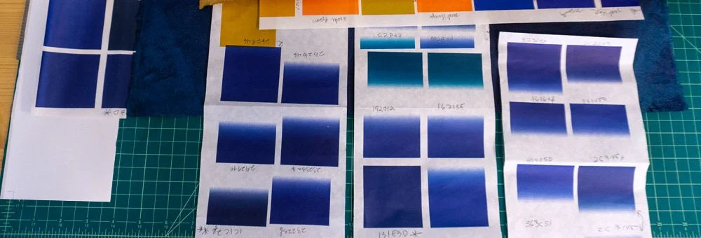
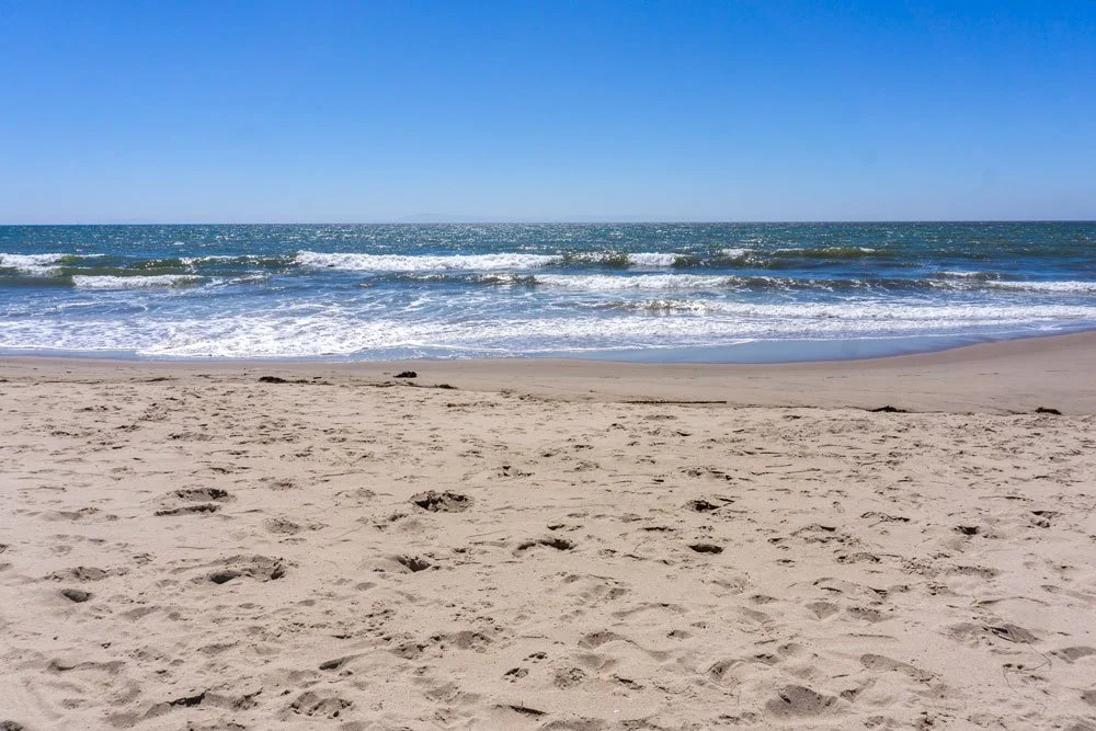
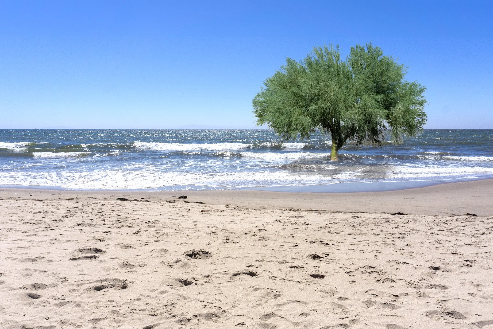
© 2026 Louise Levergneux. Fine-tuning ink settings and paper swatches to ensure the gradient values and deep blues render accurately without curling or oversaturating the delicate Asuka paper.
Testing Structures and Weight
I’m nearly ready to print a prototype for the third book, and I plan to experiment with the Red River Premium Matte 32 lb paper I have on hand. Previously, I tried the Asuka 150g, but it proved far too rigid once folded, feeling even stiffer than my favorite Moab Lasal paper I tested last month. The goal is to hit that sweet spot: flexible enough not to look rigid, yet sturdy enough to support the structure and showcase those hidden colors.
Alongside paper selection, I’ve also chosen a binding style that aligns with the heart of the project. To bring the core concept to life, I intentionally chose a soft cover. Relationships require flexibility to thrive, and I wanted the physical structure of the book, devoid of rigid, hard covers, to mirror that truth.
A Day Trip to Cave Paper
To pick up sheets of paper that had been unavailable back in the spring to finish my artist's book Nostos algos, I made the two-hour drive down to Tucson to visit Zoë at Cave Paper. While browsing their website beforehand, several other options caught my eye, and I made a mental note to inspect the rich, thick flax papers in person for Eudaimonia.
Mid-month, I found myself at Cave Paper, enjoying a wonderful conversation with Zoë about her handmade papers and brainstorming how I could incorporate these beautiful sheets into my new artists’ book project.
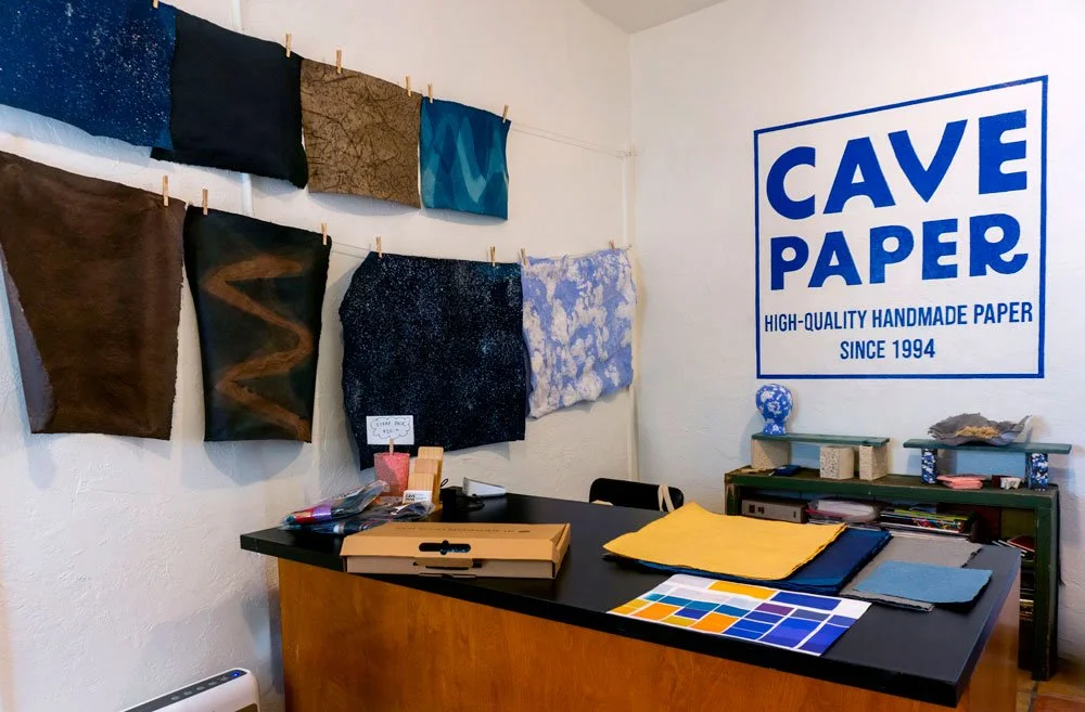
© 2026 Louise Levergneux. A look inside the front office at Cave Paper in Tucson, surrounded by hand-dyed sheets and tactile samples during my visit with Zoë.
If you are looking for exceptional, high-quality handmade paper, I couldn't recommend Cave Paper more. Most of their sheets are crafted from Belgian Flax fiber, alongside a curated selection of Abaca papers. The raw fiber is rinsed and beaten in an antique 25-lb Valley Beater, and every single sheet is formed by hand using traditional European-style moulds and deckles. Pressed and loft-dried in spurs, the resulting paper is remarkably strong and rich in texture, and they are deeply committed to sustainable practices.
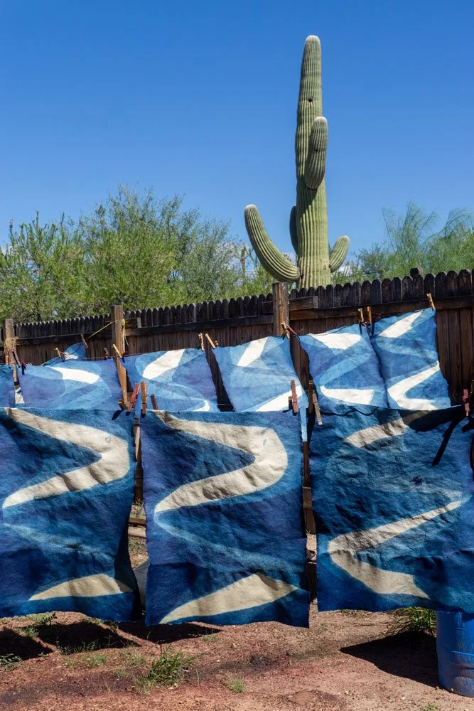
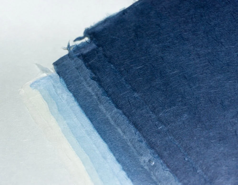
© 2026 Louise Levergneux. Freshly dyed indigo with white flax sheets air-drying outdoors at Cave Paper, framed by the iconic Tucson saguaro.
I ended up purchasing several sheets in various colors to craft the soft covers for the three different books in Eudaimonia. What an inspiring morning!
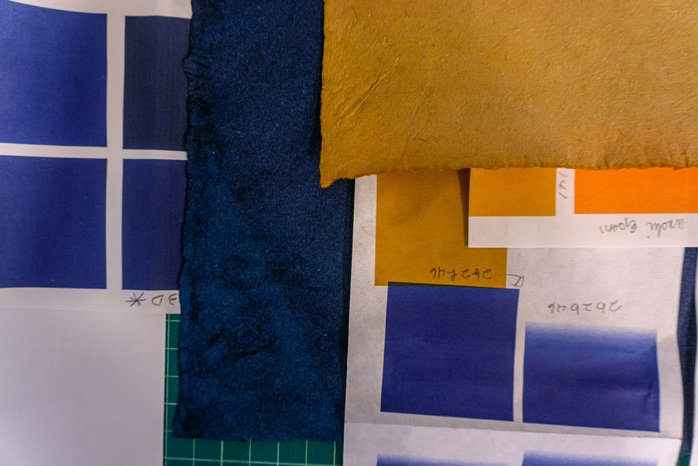
© 2026 Louise Levergneux. Comparing printed test swatches against the rich, deckle-edged indigo and natural flax sheets collected from Cave Paper to see how form and color dialogue together.
Joining the Conversation & What’s Next
Finding the exact balance between structural stability and tactile warmth is an ongoing experiment in the studio. When you work with physical media, do you usually recognize right away when a material fits, or do you find yourself testing endlessly until the dialogue between form and concept settles? I’d love to hear how you handle material choices in your own work—feel free to leave a comment.
Next month, I’ll be folding and assembling the prototype using the Red River Matte and these new Cave Paper soft covers. I'm eager to see if the structure will stand on its own to reveal those hidden color blocks, or if it will be back to the drawing board. Look out for the next update in your inbox!