
Behind the scenes of my latest artist book, where every sheet of paper argued back. A story about listening to materials, embracing glitches, and letting the book decide what it wants to become.
Some book projects arrive like a joyful sprint; others feel more like a slow, stubborn conversation with the materials. What began as a clear emotional concept turned into a year-long paper dilemma, as each new sheet, coating, and printing test pushed back against my plans. This blog post is the story of how a simple desire to capture longing on the page led me into the unpredictable territory of pushing convention with paper — sometimes fun, and sometimes decidedly not.
When I’m ready to move forward with a book project, I begin by refining my idea and asking how it wants to be perceived. The concept is one thing; the making is another. Material choices are where my projects truly begin to breathe. For each book, I select papers and structures that echo the subject and purpose, setting a mood that ties the physical object to the concept. For my latest project, I needed a tactile and auditory experience. I immersed myself in Japanese papers — Asuka, Moab Unryu, Kozo — and eventually discovered Abaca paper in an artist’s studio. Its crisp rustle opened a new path. That sound led me to research hand-dyed Abaca in shades of blue, trying to marry color, texture, and sound into a single gesture.
After a year, I found Frosted Abaca paper. It felt like the perfect answer. But the process of making often resisted my initial solutions. The prints were not vibrant, and the paper bled when I printed with my Epson SureColor P700. The technical failure was more than a setback; it forced me to reconsider the relationship between ink and substrate. One possible route was to work with a fine-art print studio to produce an edition of eight copies — a beautiful prospect, but the cost weighed heavily on the project.
I then turned to InkAid, a coating that enables direct inkjet printing on unconventional papers such as handmade Abaca. On paper, the process seemed straightforward. In practice, pressing the sheets after coating did not fully flatten them; tiny ridges remained. As the paper traveled through the printer, those raised areas caught the print head, smearing the ink and interrupting the image. Here, the material was speaking clearly: it would not behave as a neutral surface. Additionally, because handmade paper batches vary, sourcing consistent supplies was difficult, highlighting the unpredictability of working with such materials.
These repeated dead ends began to drain my energy. So I allowed the project to recede slightly while I worked on another book. That pause was not an abandonment but part of the process — a chance to let frustration settle and to return with renewed patience. Still, I kept circling back, determined to find a way to make the paper physically embody the book’s meaning.
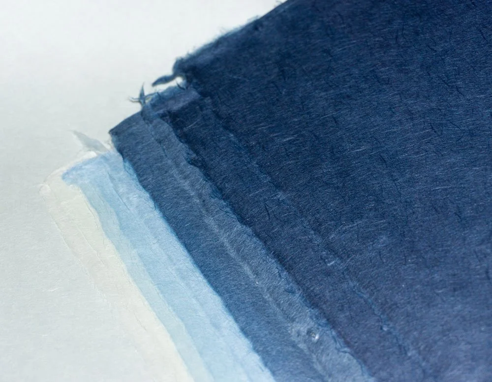
© 2026 Louise Levergneux. I ultimately selected the sky blue, pale blue, blue, and navy papers from the ECG Echizen Shikibu Color Gampi series. Handmade by Yamaki Paper Mill in Fukui, Japan, these durable sheets are dyed in a subtle range of shades and remain translucent, even in the deeper tones. They are crafted from 100% Japanese Gampi fiber.
At a certain point, every long project raises the same question: when does one give up on a work that seems to generate more obstacles than successes? When I finally returned to this project after letting it rest, that question surfaced again. Persisting through these challenges helped me see that I was forcing materials rather than listening to them, reinforcing the value of perseverance.
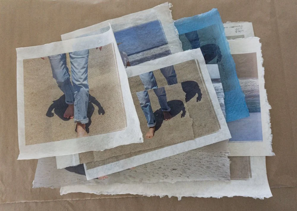
During a visit to Hiromi Paper Inc., I discovered Echizen Shikibu Color Gampi and Asuka paper. This pairing offered a new structure: two distinct but related surfaces, each carrying a different part of a narrative. I felt the project come back to life — but as I’ve learned, materials have their own timing and intentions.
I tested printing with the Asuka paper and arrived at a presentation of the pages with images that felt right. On the Gampi paper, I brushed on two to three coats of InkAid to stiffen the very delicate paper, listening for just the right crisp rustle as the pages were paginated. The sound became a form of editing: too soft, and the pages lost presence; too harsh, and they overwhelmed the images. Only when that balance was found did I move on to the many assembly steps needed to complete a prototype of the book.
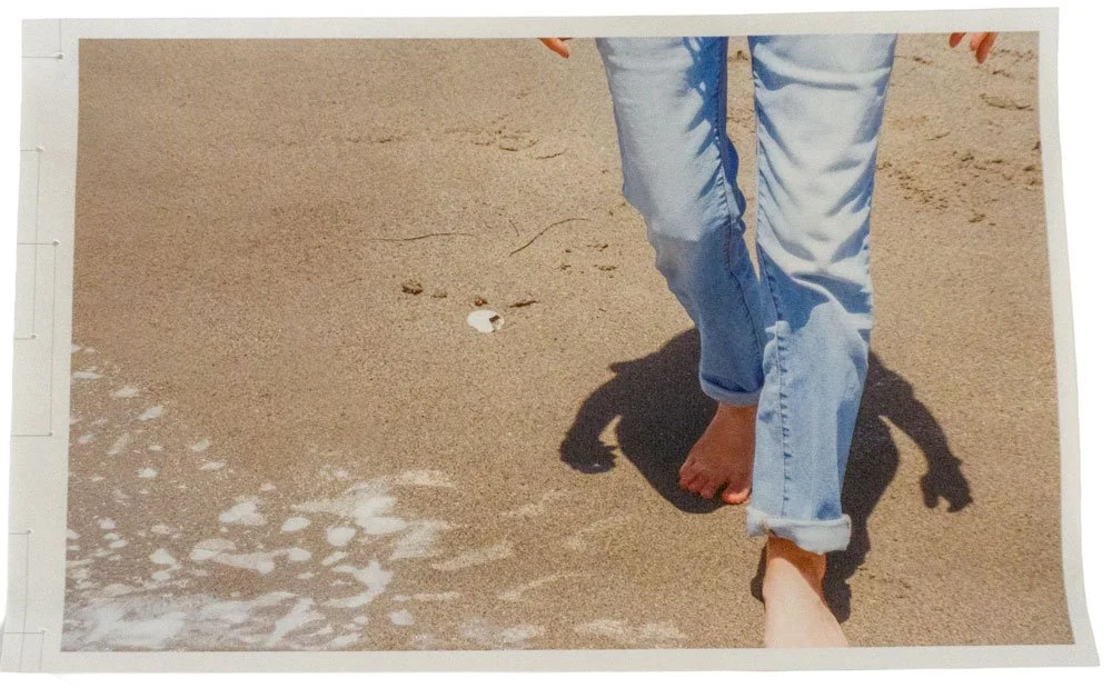
© 2026 Louise Levergneux. A sample page printed on Asuka Paper from Hiromi Paper Inc.
Not all glitches arise from paper alone. I’d met this kind of resistance before, while choosing the bookcloth for Pistolero. I had initially bought a small roll of Lineco linen bookcloth, available only in 17 × 19 in (43 × 47 cm), at the local art shop, simply to test color and texture on the prototype. Buying by the yard would have been more sensible in the long run, but at that stage, I was still listening to what the book needed. Once I committed, I contacted supplier after supplier, only to hear of backorders and uncertain restocks. For nearly three months, I navigated these practical constraints. Eventually, I tracked down nine small rolls — an expensive and time-consuming solution, but one that reinforced a core lesson: patience and flexibility are not optional; they are integral to the creative process.
In the end, this book reminded me that true collaboration with materials means accepting uncertainty, trusting the process, and allowing the work to reveal the form it needs to take.