
The Arizona summer made it clear who was in charge last month. The relentless heat kept me indoors, giving me a quiet excuse to retreat deep into my studio and pour my energy into my upcoming artist book, Eudaimonia.
Even with the usual administrative noise that comes with keeping a studio running, my mind kept drifting back to the tactile reality of the object itself—how it will feel in a reader's hands, how the structure will hold the story.
The idea for this book first took root early in 2024. Ideas often need time to settle before they reveal how they want to be made. Over these past months, that initial spark of imagination has given way to active discovery—a shift from dreaming to the frustrating, beautiful work of finding the exact physical materials to carry the emotion through.
The project explores the changing landscape of a lifelong relationship across three distinct volumes. To ground this narrative, I chose a French Fold format, where the hidden inner folds reveal solid blocks of color.
Because the paper must yield to tight scoring without cracking or exposing raw white fibers, finding the right paper became a central puzzle. I initially gravitated toward Hahnemühle Photo Rag Book and Album (220 gsm) for its smooth, tactile surface. But cotton rag’s long fibers and coating, while gorgeous for single pages, make it prone to cracking along a sharp crease when heavy ink is involved.
So I turned to Moab Lasal Matte and Red River Premium Matte. Alpha-cellulose pulp papers take deep ink without curling or cracking along the fold. At first, I loved Lasal’s stiffness—it let the book stand boldly on display, showing off those hidden inner folds. But as I kept handling it, something felt wrong. It was too rigid, creating a heavy structure that felt out of sync with the fragile, delicate idea behind the book.
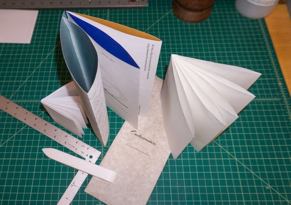
© 2026 Louise Levergneux. Studio mock-ups demonstrating the French Fold behavior—testing paper response along the spine folds and previewing the interior palette.
That realization sent me back to the drawing board. I started experimenting with paper after paper, searching for something that balanced structural integrity with quiet grace. I’ve landed on Asuka 70g from Hiromi Paper. It has a lovely, subtle body that supports double-sided printing, but page turns feel soft, intimate, and inviting. I’m currently waiting on the right paper dimensions to print a full prototype and see if my intuition holds up.
Alongside the paper trials, I’ve been searching for the precise colors to peek from the folds—three primary hues to reflect the emotional passage of time.
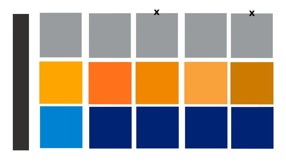
© 2026 Louise Levergneux. Color study for the three-part narrative. Testing five tonal variations across grey, warm amber, and deep blue to capture the shift of a lifetime relationship.
I’ve been testing variations in tone and value—like the grey, amber, and deep blue swatches above—trying to find colors that quietly breathe under the text and poetry rather than compete with them. The next step is seeing how these inks actually settle into the surface of the paper.
As autumn settles in, the studio is coming alive with incoming materials—some to complete the edition of Nostos Algos, and others dedicated to this new work. I’m especially looking forward to working with Zoë at Cave Paper again to source its rich, thick flax paper.
After months of testing, searching, and waiting, the planning is starting to quiet down. Now comes the best part: pulling up to my desk, opening Photoshop, and figuring out the best layout to express what’s been in my head for so long.